Sunday, April 26, 2009

Bivariate choropleth maps

http://www.geocities.com/stevejford/Africa_Choropleth.jpg

This map shows the life expectancy, land use, and gnp per capita of Africa. This map has managed to use three different variables and include them onto one map of Africa with colors and a pie chart.

Star plots

http://addictedtor.free.fr/graphiques/graphiques/graph_63.png

A star plot is a way to produce different variables in a graph and keeping the graph two dimensional. This star plot includes 7 different variables from each type of automobile maker.

Correlation matrix


http://yin.che.wisc.edu/images/ProteinMatrix.jpg

A correlation matrix shows the similarities between two variables. The above graph shows the correlation for a protein cell at a certain stage.

Similarity matrix


http://tomcat.esat.kuleuven.be/txtgate/images/distmat.png

A similarity matrix expresses the similarity between two data points.

Stem and leaf plot

http://mainland.cctt.org/mathsummer/JosephBond/StemAndPlots/images/table2.gif

A stem and leaf plot is another way to organize and display quantitative data. The stem accounts for the first number slots in a number while the leaf accounts for the final digit in a number.

Box plot

http://support.sas.com/rnd/base/topics/statgraph/proctemplate/images/boxplot.gif

A box plot is a convenient way to group together similar statistics.

Histogram

http://www.daisy2000.com/Daisy2003/HorizontalHistogram.gif

A histogram is a display of tabulated frequencies shown as bars. This histogram shows the amount of wins each jockey has had and the total winnings for a season.

Parallel coordinate graph

http://raffy.ch/blog/parallel.jpg

A parallel coordinate graph uses lines to correspond to each axis.

Triangular plot

http://ex-parrot.com/%7Echris/images/20050407/triangle.png

This triangular plot took the percentage of conservative, labour, and liberal democrat votes and summed them up.

Windrose

http://www.climate.washington.edu/windrose/Seattle-WindRose.jpg

A windrose is a graphic tool used by meteorologists to give a view of how wind speed and direction are typically distributed at a particular location. This is a wind rose of the wind speed and direction of Seattle Washington.

Climograph

http://geography.ridley.on.ca/CGC1D/Students/Quebec2/Geo./Climographs_files/image003.png

A climograph records both temperature and rainfall for a 12 month period. Usually the graph is depicted with both a bar graph and a line graph. This graph shows the average temperature per month in Quebec as well as total precipitation for each month.

Population profile

http://www.ifad.org/operations/regional/pf/figure1.gif

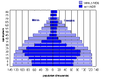
A population profile shows the amount of people within a population that fit a category. This profile shows the amount of people with and without AIDS in parts of Africa.

Scatterplot

http://cia.psyc.memphis.edu/rad/7302/scatterplot.gif

Scatterplots are used like line graphs. They place data among a graph and can be used for up to 4 dimensions.

Index value plot


http://www.mathworks.com/products/demos/shipping/garch/garchcopulaevtdemo_01_thumbnail.png

An index value plot is used to show differences by using a line graph. This plot shows the different market closing values between 6 different countries over 12 years.

Accumulative line graph or Lorenz curve

https://blogger.googleusercontent.com/img/b/R29vZ2xl/AVvXsEgoVSFF0IUofAbLOhUZMx9eEPg23uqPQpNsZs8u7kYH3beFKqjQUg0SSy8SOrAQdBPArWChm-6KEk8d2ByGcMEF7mnoBnGeAE1KADdCDe2-rwePXADbZy-KKQkVKQ57WjW8_sQxcvEOORgc/s400/Lorenz+curve.jpg

A lorenz curve shows inequality of some sort. This graph shows how the poorest 20% of the economy accounts for 4% of all the income. This shows how 80% of the rest of the population counts for about 96% of the total income.

Bilateral graph

http://www.treas.gov/press/releases/images/november%20jobs%20graph.jpg

A bilateral graph shows at least two different variations. This bilateral graph is a line graph that represents the fall of the unemployment rate and the rise of jobs from 2003-2005.

Standardized choropleth maps

http://www.statcan.gc.ca/pub/92f0138m/2008003/figures/figure3.1-en.jpg

Standardized choropleth maps are used to compare data. This map shows the percentage of Canadians under the age of 14.

Unclassed choropleth maps


http://www.princeton.edu/%7Ervdb/JAVA/election2004/purple_america_2004_small.gif

Unclassed choropleth maps do not show as specific data as a classed choropleth map. Unclassed choropleth can have no boundaries or like this one show data that has no numerical value. This map shows the 2004 presidential election by county and the shade of the color shows whether a county voted democratic or republican.

Classed choropleth maps

http://www.es.mq.edu.au/courses/GEOS219/images/deaths.jpg

A classed choropleth map shows data in a specific class by coloring in the proportional area on the map. This map shows the amount of deaths for children under 1 years old in Australia.

Range graded proportional circle map


http://www.gutenberg.org/files/15478/15478-h/images/image10.png

A range graded circle map shows the area of a map that is going to be examined for data. This map shows the area that will be tested in Europe.

Continuously variable proportional circle map

http://www.neiu.edu/%7Ejrthomas/377/circle.jpg

A proportional circle map shows data on a map by using circles. The larger the circle the larger the data. In this map each circle represents the Mexican population in the western US.

Thursday, April 23, 2009

DOQQ Map

http://seamless.usgs.gov/website/seamless/products/1mdoqq.jpg

A DOQQ map is an aerial photograph that is geometrically corrected. The above map has been corrected to a 1 meter scale and is a photo of Washington D.C.

DEM Map

http://images.google.com/imgres?imgurl=http://nsidc.org/data/docs/daac/nsidc03t 04_0305_glas_dems/GLAS_Antarctic_DEM.jpg&imgrefurl=http://nsidc.org/data/docs/daac/nsidc0304_0305_glas_dems.gd.html&usg=__yO4g7JweSep_AS57rbNveHnMoV8=&h=300&w=360&sz=22&hl=en&start=7&tbnid=3lkRXeAj_dTT8M:&tbnh=101&tbnw=121&prev=/images%3Fq%3DDEM%26gbv%3D2%26hl%3Den%26sa%3DG

A DEM map is a digital elevation map that is a digital representation of terrain. The above picture is an example of a DEM map of Antarctica. I do not understand what the hole in the center is.

DLG Map

http://proceedings.esri.com/library/userconf/proc00/professional/papers/pap691/p6911.gif

A Digital line graph map can show almost any geographical map. It can include such things as borders, roads and utility lines and much more. The above DLG map shows lines of transportation, railroads and pipes.

DRG Map

http://www.tceq.state.tx.us/assets/public/gis/images/drg.gif

A DRG map is a scanned image of a U.S. Geological Survey (USGS) topographic map. The above is a map from a city in Texas.

Isopleth Map

http://nadp.sws.uiuc.edu/isopleths/maps2003/cldep.gif

Isopleth maps simplify data with a continuous distribution. The above map shows the amount of Chloride ion across the United States of America.

Isopach Map

http://www.searchanddiscovery.com/documents/2007/07022lash/images/ani04.gif

Isopach maps show the stratigraphic thickness of a rock unit. The above map shows the thickness of the rock units that make up part of Ohio, Pennsylvania, and New York.

Isohyets

http://soer.justice.tas.gov.au/2003/image/265/water%20quantity/m-ilw_quantity_rainfall-l.gif

Isohyets maps are used to show the amount of rainfall in an area. The above map shows the annual rainfall for the island of Tasmania.

Isotach Map

http://www.srh.noaa.gov/mfl/newpage/graphics/051200_eta_18hr_Qn.gif

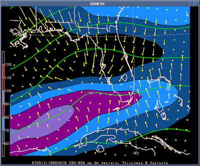
Isotach maps are used to show equal wind speed. This map shows the wind speeds that are going both with and against the weather system.

Isobar Map

http://www.csag.uct.ac.za/files/images/synoptic_chart2.gif

Isobars are lines that are used to show the difference in pressure. The above image is an example of different levels of pressure around the high pressure system.

LIDAR Map

http://www.imagingnotes.com/ee_assets/email_images/Lidar_KansasCity_MJHarden.jpg

LIDAR stands for Light Detection and Ranging. LIDAR uses properties of scattered light to determine the distance between objects. The picture above is a LIDAR image of Kansas City.

Doppler Radar

http://www.weatherusa.net/blog/images/doppler-orlando-1943.gif

Doppler Radar is used to view weather that is near by. The original doppler radar is a system that returned echoes from an object to determine radial velocity. Weather stations have used the system so much that doppler radar today is known as weather radar instead of it's orignal use. This doppler picture is one of hurricane Charlie that hit Florida in 2004.

Wednesday, April 22, 2009

Black and White Aerial Photo

http://freegeographytools.com/wp-content/uploads/2007/09/doq-thumb.jpg

Black and white aerial photographs are used to survey a area of land. Since they are not as common many aerial photographs are taken and then compared to detemine change.

Infrared Aerial photo


http://www.umesc.usgs.gov/data_library/gis_data/aerial_photos/1994_illinois_river_72dpi/la_grange/181-007-lg-1994.jpg

Infrared aerial photos are used to determine the change that could occur to certain areas, and can be used to notice things that are not normal. This is a picture of water quality in a water plant.

Cartographic animations


http://www.stormsurf.com/page2/tutorials/hurricane-andrew-poesvis2a.gif

A cartographic animation is a graphic map that can be put into motion. The above picture is a graphic photo of hurricane Andrew. The picture allows for a better look at the shape of the hurricane and when it is put into motion you can see the path the storm is taking.

Statistical Map


http://www.denvergov.org/Portals/335/images/SOPA_bur02.jpg

A statistical map is used to show stats of a certain area. This map shows the number of burglaries from one year to the next in the city of Denver. The key to the right shows what each color represents.

Tuesday, April 21, 2009

Cartogram Map


http://images.google.com/imgres?imgurl=http://www.amphibiaweb.org/amphibian/cartograms/cart_global_diversity.jpg&imgrefurl=http://amphibiaweb.org/amphibian/cartograms/&usg=__9NX570M1XmBT-ko4Twf4ljqTB-o=&h=354&w=575&sz=41&hl=en&start=1&tbnid=rmLmGmVq8drdyM:&tbnh=82&tbnw=134&prev=/images%3Fq%3DCartograms%26gbv%3D2%26ndsp%3D18%26hl%3Den%26sa%3DG


A cartogram map is a map that places value by area. A certain geographical area can be reshaped to show a certain value of data. Cartogram maps also use color to interpret the data as well. This Cartogram map shows the amount of endangered species by country.

Flow Map

http://www.mekongmigration.org/wp-content/uploads/2008/08/migration-flow-map-august-2008.JPG

A flow map shows the movement of data from one place to another on a map. This flow map shows the migration of labor from countries to other countries.

Isoline Map

http://www.tutorialsolutions.com/isolines.gif

An Isoline map is a map in which lines connect places of the same value. In this map the lines represent the amount of gasoline that is found around the service station. As you can see the number that are equal are connected by the same line.

Proportional Circle Map


http://www.neiu.edu/%7Ejrthomas/377/circle.jpg

A proportional circle map shows data in proportion to the size of the circle. The larger the number is, the larger the circle is on the map. This map shows the population of Mexicans in the western United States. The larger the population of Mexicans, the larger the circle is in that state.

Choropleth Map


http://my.ilstu.edu/%7Ejrcarter/Geo204/Choro/map-AmFact-6eqint-orange-80pct.jpg

A Choropleth map is a map that uses colors to present data. Each color will symbolize a certain amount or number of information and will color in a certain part of the map accordingly. This map is a representation of how many males there are per 100 females in each state. In this particular map the darker the color the higher number of males there were.

Dot Distribution Map

http://www.biologie.uni-hamburg.de/b-online/ibc99/IDB/nrspecie.gif

A dot distribution map is used to show how much of something is in a particular area. Dot Distribution maps are commonly used to show such things as population, but this map shows the number of plant species in certain areas of Europe. This Dot Distribution map also shows the number of species by changing the color of the dot, while many other Dot Distribution maps just intensify one color if the area has more cases.

Propaganda Map

http://strangemaps.files.wordpress.com/2006/11/800px-reagan-digitised-poster.JPG?w=474&h=362

A propaganda map is used to try and persuade the opinions and ideas of others. This map is obviously an exaggeration of propaganda, but it could be used to try and persuade someone to not support Ronald Reagan.

Hypsometric maps


http://geology.com/news/images/shaded-relief-map.jpg

A hypsometric map is a map that shows elevation and surface by tinting, coloring, or shading in areas. The lower elevation in this map is colored in green, while the higher elevation is colored white. The above map is one of Southern California.

PLSS Map

http://ok.water.usgs.gov/arbsimp/images/plss.jpg

A PLSS map is a map that allows for the creator to divide and describe land individually. This map divided the land of an Oklahoma county which was then used to determine the quality of water in each town.

Cadastral Map


http://images.google.com/imgres?imgurl=http://aplr.org/nedit/assets/eng09.jpg&imgrefurl=http://www.aplr.org/%3Fid%3D299%26pid%3D650&usg=__pTGavckGmxYvJOniWfuDtssDj2w=&h=400&w=500&sz=57&hl=en&start=4&tbnid=SnBe-MLh2z8MVM:&tbnh=104&tbnw=130&prev=/images%3Fq%3DCadastral%2Bmaps%26gbv%3D2%26hl%3Den%26sa%3DG

A Cadastral map is designed to show the borders, and lines of land or property. This map shows the borders of each individuals property by using dark red lines.

Thematic Map


http://www.sou.edu/Geography/JONES/GEOG280/stpop96.GIF

A thematic map is meant to portray anything about a certain area that is wanted. The above map shows the change in population of the United States of America during a 6 year period.

Topographic Map


http://www.dem.ri.gov/maps/mapfile/wma/map22b.jpg

The above map is a topographic map. A topographic map shows the shape of a certain area and includes different landscapes. This map shows land that is marsh, land that is solid and land covered by water.

Plainimetric Map

http://geopubs.wr.usgs.gov/open-file/of03-383/figure1.gif

The above map is an example of a plainimetric map. This type of map focuses on the horizontal characteristics of a map and does not take into consideration the vertical. This map shows rivers that run through California.